Workoutspace
Full-stack brand and web design for an Amsterdam personal training studio — from identity and website through to print marketing and conversion strategy.
The project
Workoutspace is an upscale personal training collective in Amsterdam offering a blend of training and mindfulness. When the founders transitioned from operating out of a local gym to opening a private studio, they needed more than a new name — they needed a brand presence that could carry the weight of that ambition and bring in the customers to match. What started as a web design conversation grew organically into something broader: brand identity, marketing strategy, print advertising, motion design, and copywriting.
My role
End-to-end ownership across brand, UI/UX, web development, motion design, copywriting, and marketing strategy. I deferred social media management and SEO to a specialist — those disciplines get complex quickly and are better handled by someone whose full focus they have. Everything else was mine.
The challenge
Workoutspace was starting from scratch in a meaningful sense. Before the rebrand it was two freelance personal trainers; after it, a fully realised private studio with a brand identity, a digital presence, and a physical location to fill. The design had to do real commercial work — not just look premium, but convert visitors into paying customers. The target audience ranged from busy young professionals to expats to seniors, which meant the brand had to feel inclusive without feeling generic.
What I did
Skipping the wireframe
I made a deliberate call early on to go straight to a polished first homepage version rather than presenting wireframes and IA diagrams. This wasn't cutting corners — it was reading the client. Merlin is a visual thinker and an entrepreneur; a wireframe meeting would have been the wrong first impression for the wrong reasons. A polished visual got us to a productive conversation faster.
Building a brand from a logo outward
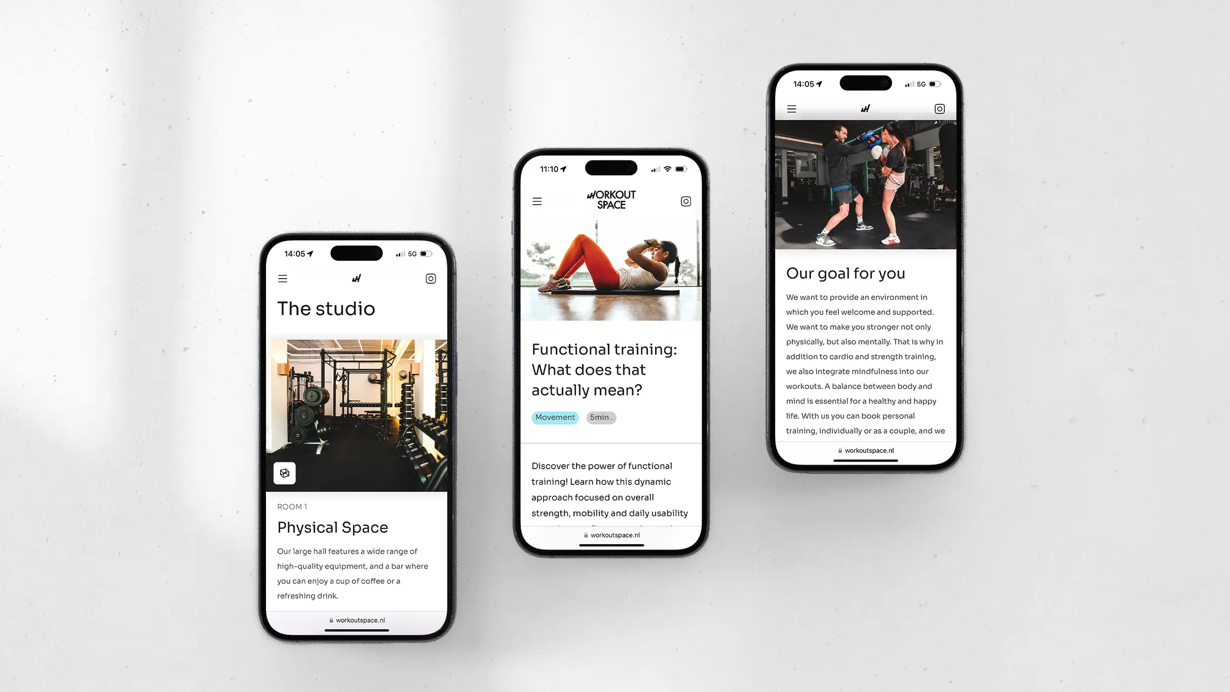
The logo was designed by a third party before I came on board. Rather than starting from scratch, I used it as a foundation — extracting the geometry, the philosophy of upward movement, and the overall character, then building a full visual system around it. Color, typography, texture, photography treatment, and motion language all grew from that single starting point.
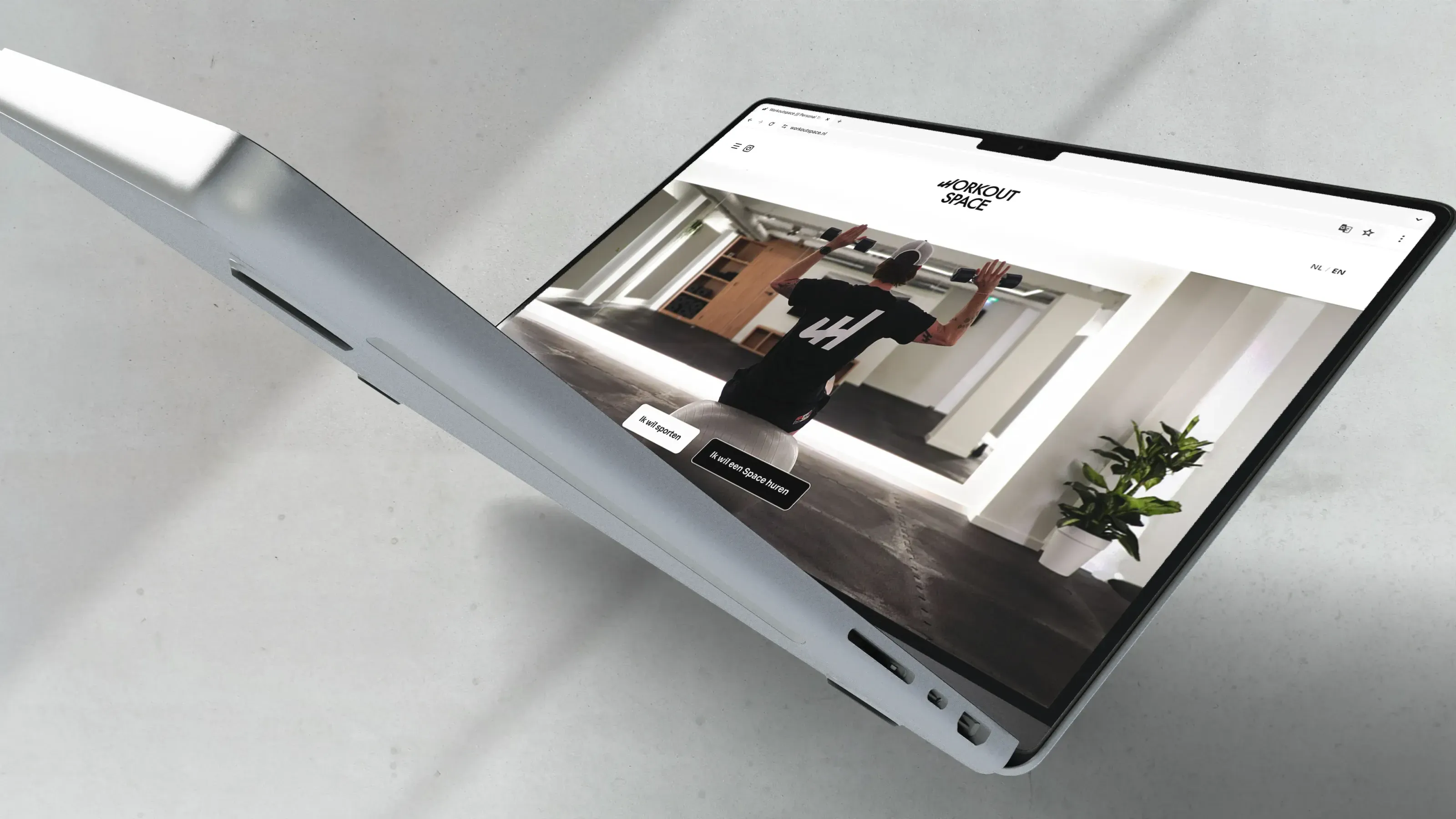
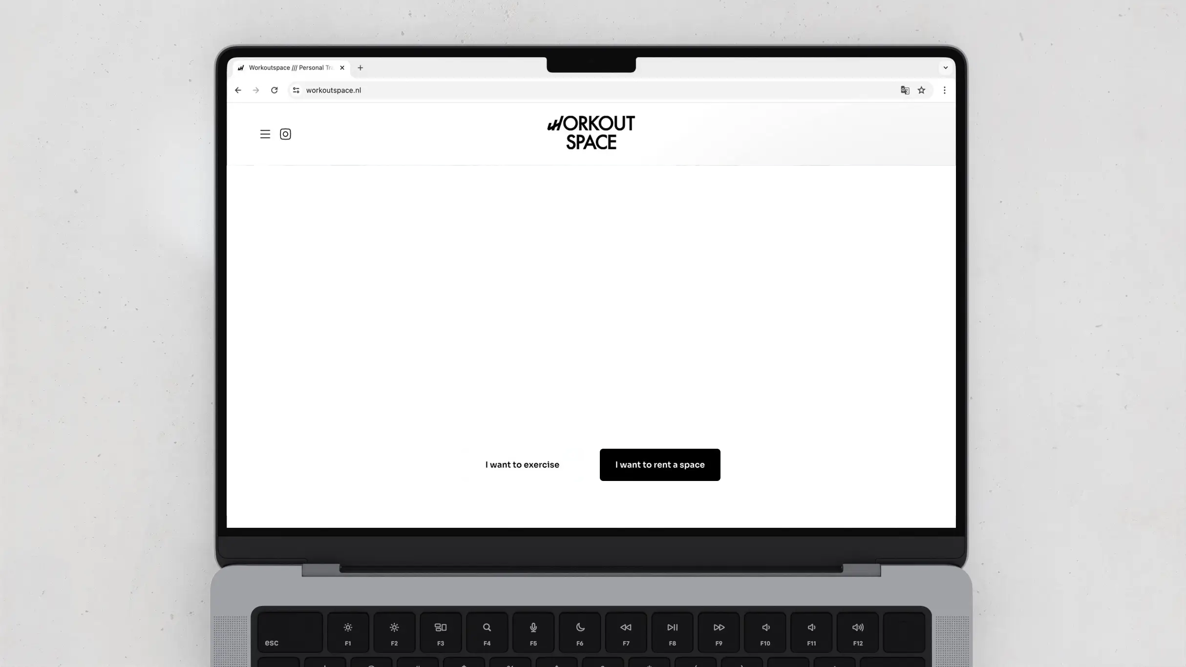
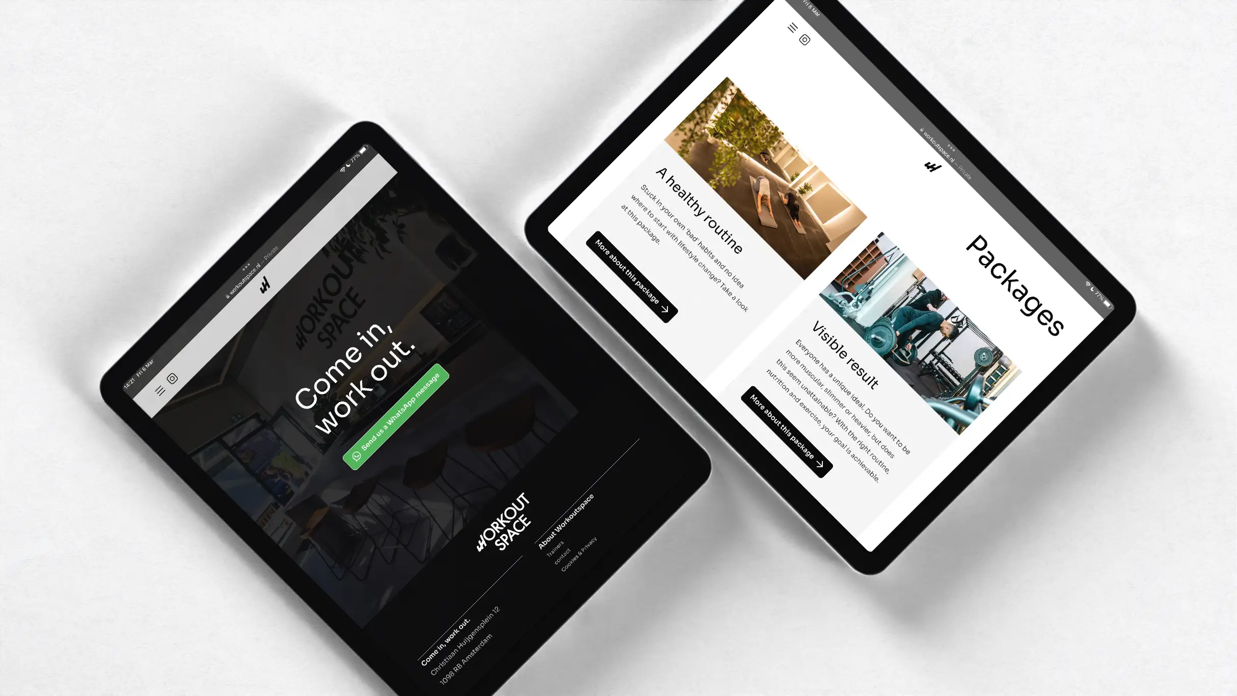
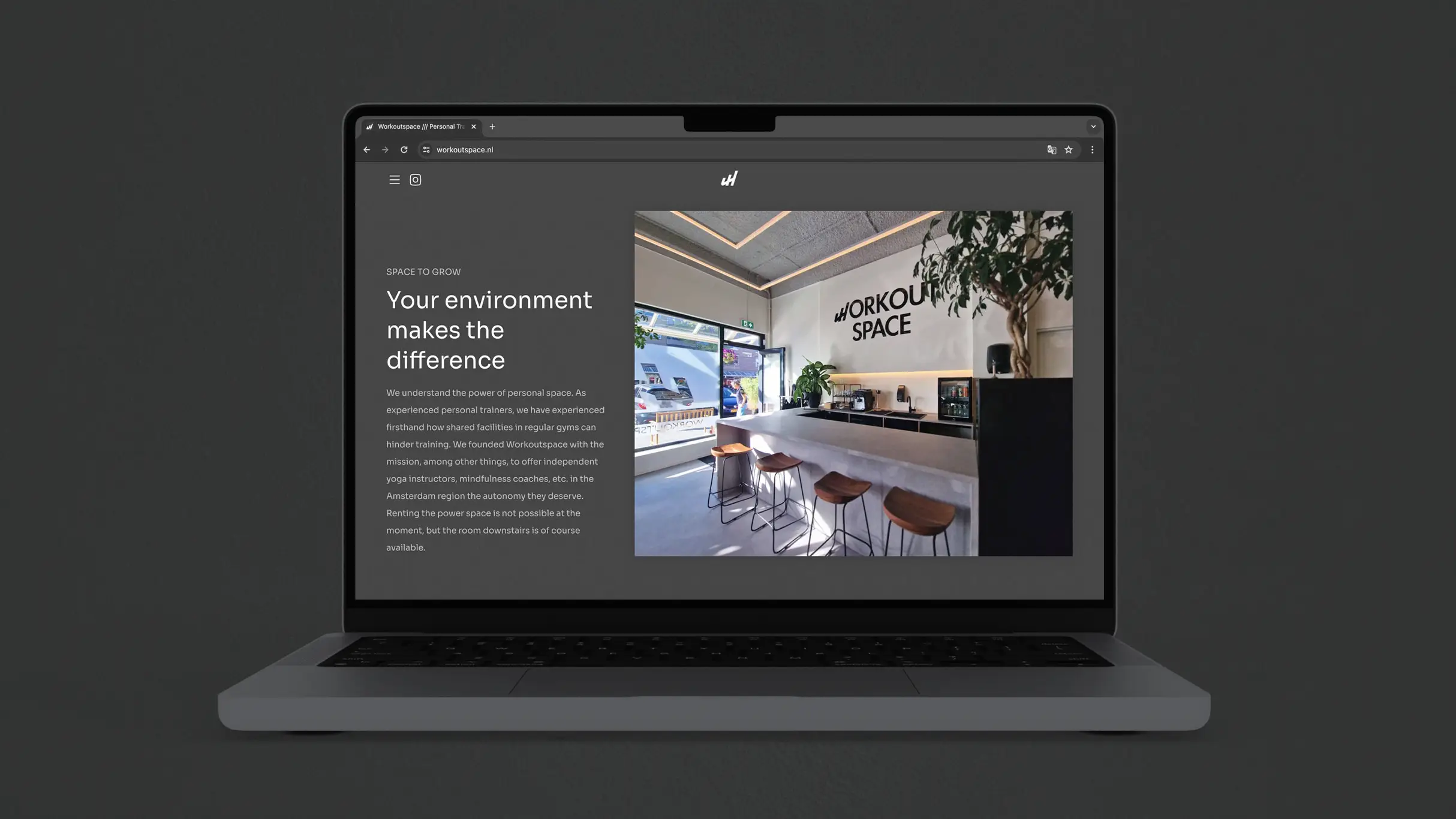
A narrative-driven website
The homepage was structured around what I think of as a hook, line, and sinker approach: first engage the visitor, then convince them, then give them an offer they can't refuse. Every section was written and designed to move the visitor one step closer to making contact — not through pressure, but through a sequence of questions answered before they were asked. Calls to action linked directly to WhatsApp rather than a contact form, because in the Netherlands that's simply how people prefer to communicate.
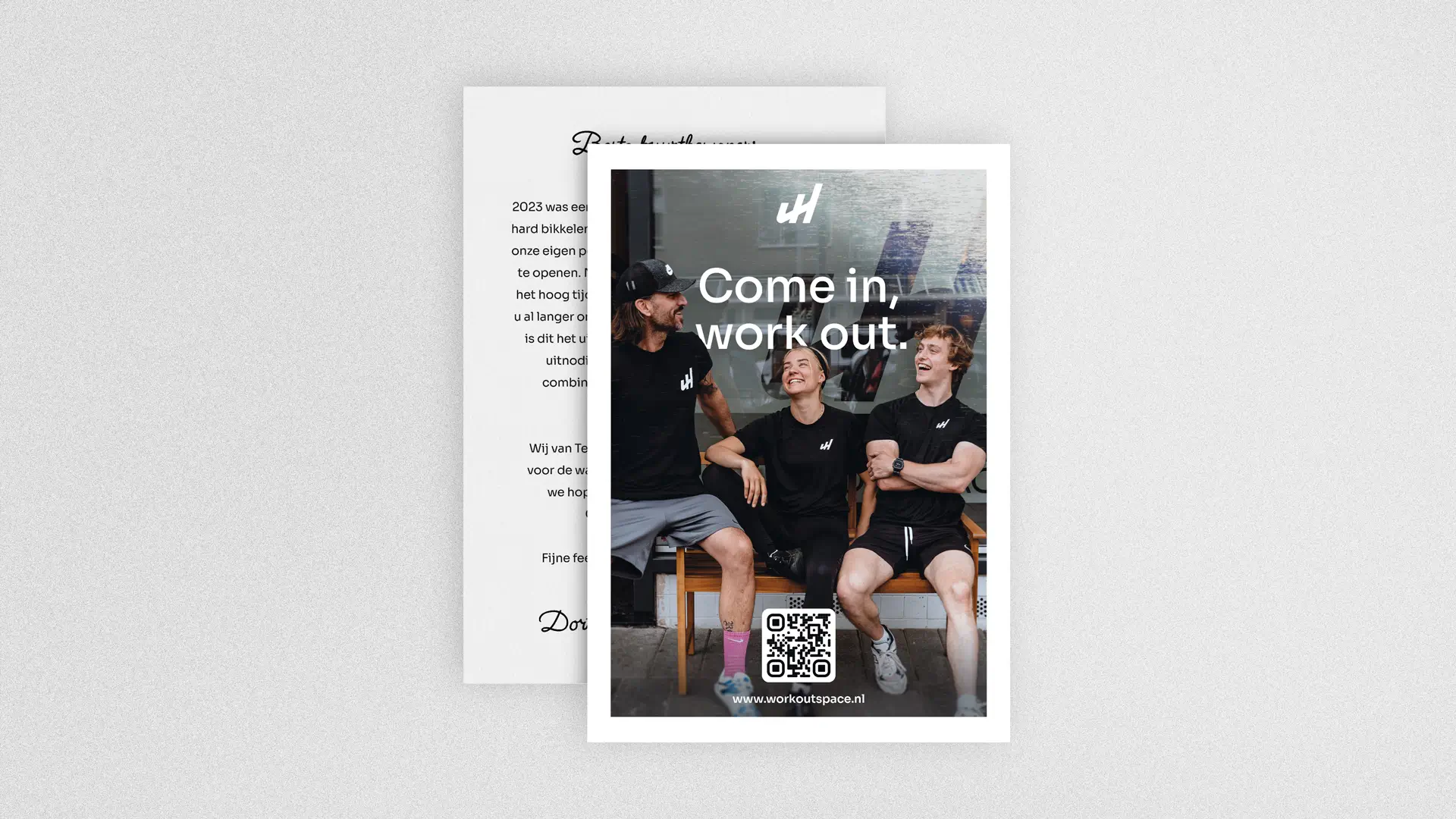
The holiday card
Workoutspace's reach as an in-person service is geographically tied, so we targeted surrounding neighborhoods with print advertising. A holiday card was a different proposition entirely — people already receive cards in the mail around the holidays; it's a format with warmth attached to it. The timing was deliberate too — New Year's resolutions mean fitness is already on people's minds. According to the client, print advertising — led by the holiday card — accounted for approximately 70% of online traffic in the months following launch.
Knowing when to defer
At a certain point the project moved into social media management and SEO territory. I have working knowledge of both, but day-to-day platform management is a specialism that benefits from full focus. I recommended bringing in a dedicated resource rather than stretching the scope thin.
The result
According to client-reported analytics, approximately three months after launch: weekly prospects increased by 400%, from roughly one per week to four or five. Website traffic doubled. The conversion rate stood at 7%. Around 70% of traffic was direct or organic, reflecting the effectiveness of the print marketing. These figures were reported by the client rather than tracked independently, but the direction of travel was consistent across all metrics.
Looking back
This project is a good example of what happens when a client brings genuine commitment to the table. Merlin and Matthijs were invested in doing it properly, which made it possible to do it properly. The best outcome of a project like this isn't just the metrics — it's that the brand still feels right a year or two later. Workoutspace does. I'm proud of that.
Want to see the full process?
Research findings, wireframes, user testing results, and complete design iterations are available to hiring managers and design leads.
If you liked this case study, you might also like
Fizz
.