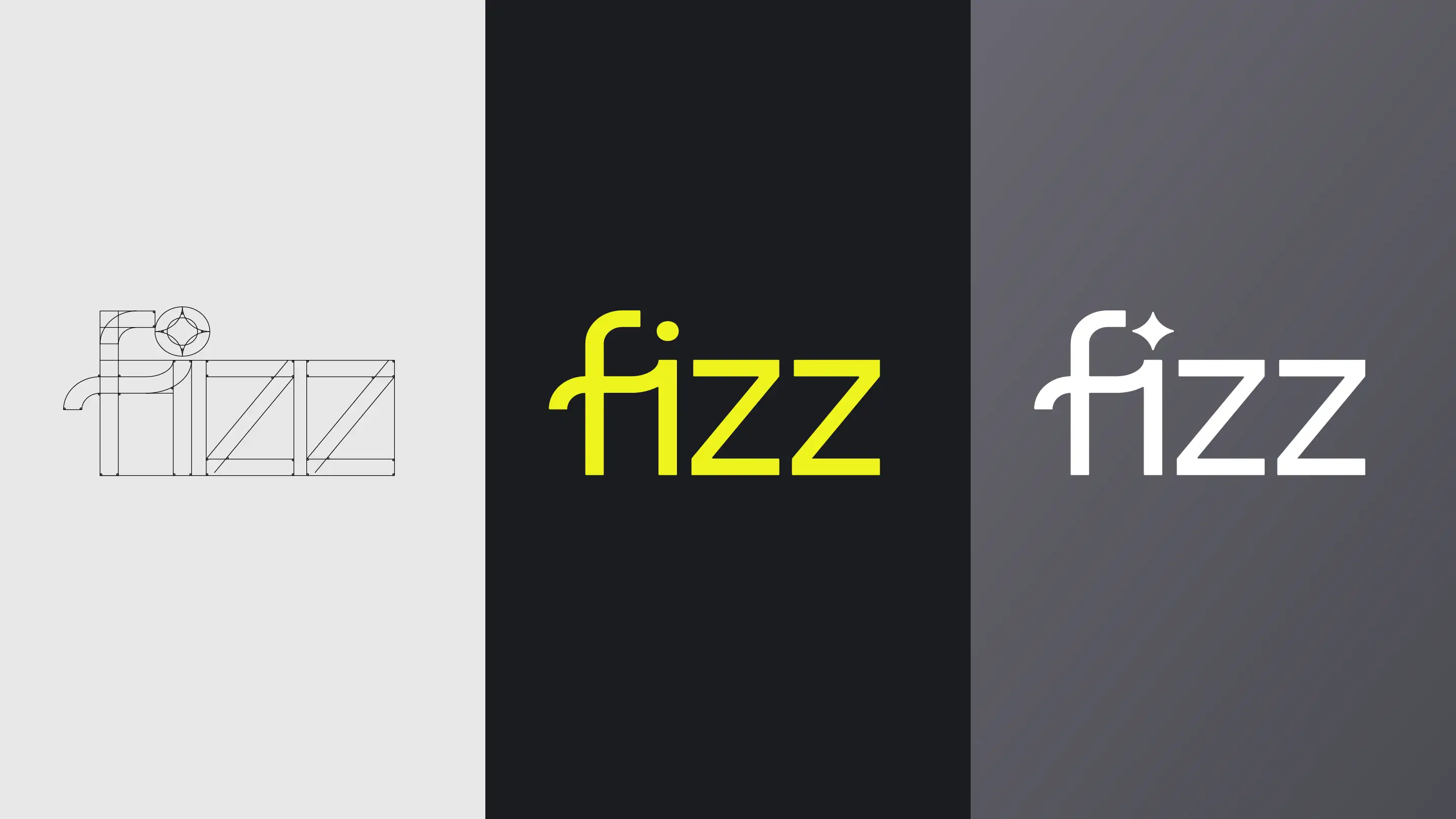
Fizz
Two years of visual design for a YC-backed fintech startup — building and evolving a brand that had to make finance feel relevant to college students.
The project
Fizz helps college students build healthy credit scores through a debit card and accompanying app. Backed by Y Combinator and Kleiner Perkins — the firm behind Google, DoorDash, and Airbnb — the company grew to serve tens of thousands of students across 300+ US universities since its 2023 launch. I joined as a contracted visual designer shortly after launch and stayed for two years.
My role
Visual design across the full brand — primarily marketing assets and in-app illustration, with some work feeding directly into interaction design. I was part of a three-person design team alongside a head of design and a UI/UX designer. Over time I took on increasing creative ownership, particularly when it came to brand direction for Fizz Premium.
The challenge
Marketing finances to college students is genuinely difficult. The demographic is allergic to anything that feels corporate or patronising, moves fast, and has a finely tuned radar for inauthenticity. The design had to feel bold and current without chasing trends, and serious enough to be trusted with someone's financial life without feeling like a bank.
What I did
Making the brand my own
I was onboarded with an existing style direction and brand guidelines developed by Metacarbon. The first job was learning the system well enough to work within it faithfully. Over two years that shifted — gradually, then noticeably. By the end I had meaningful creative latitude within the brand, which is a dynamic I'd take over unconstrained freedom most days. Constraints make the interesting decisions possible.
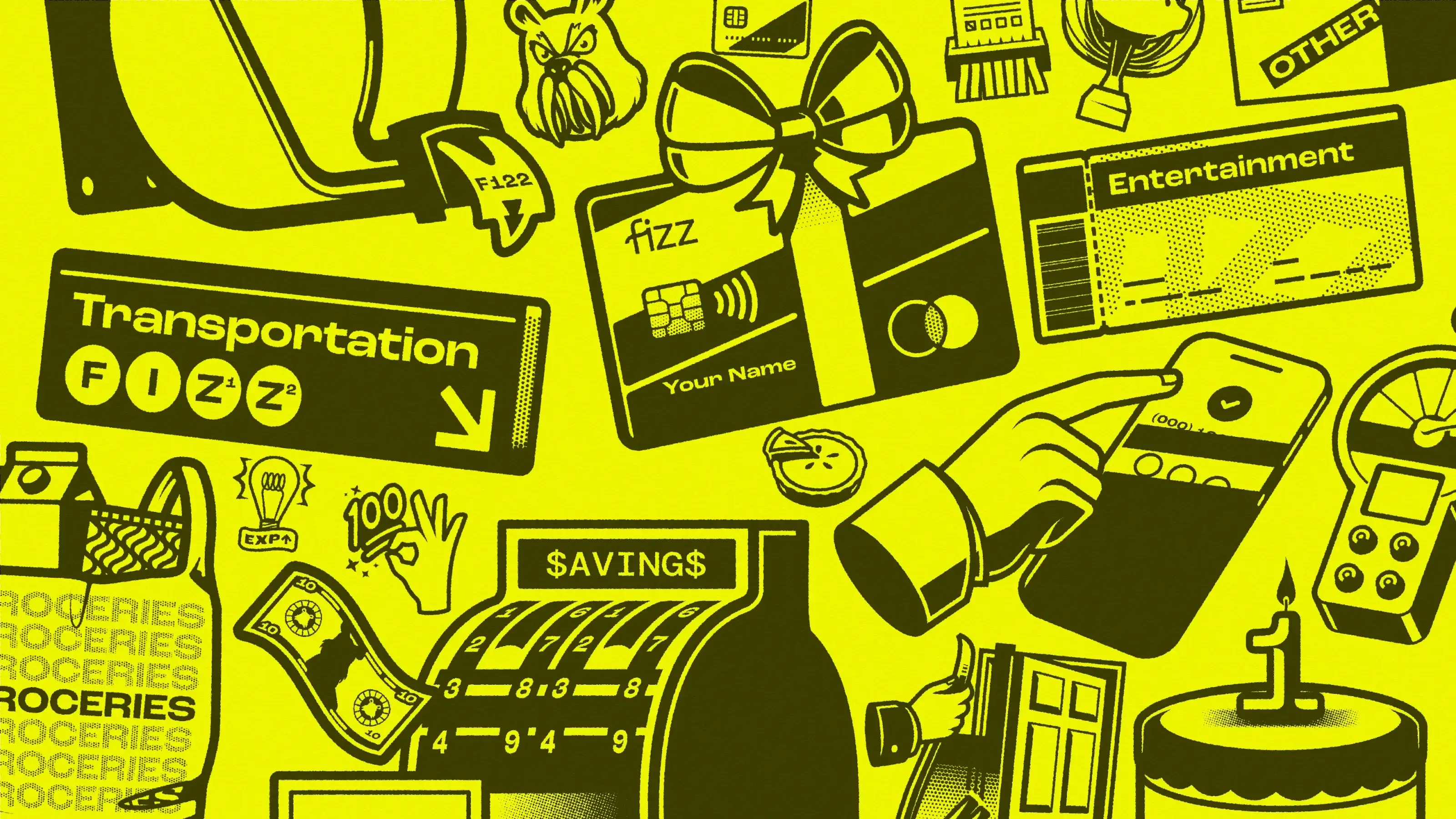
Building an illustration system
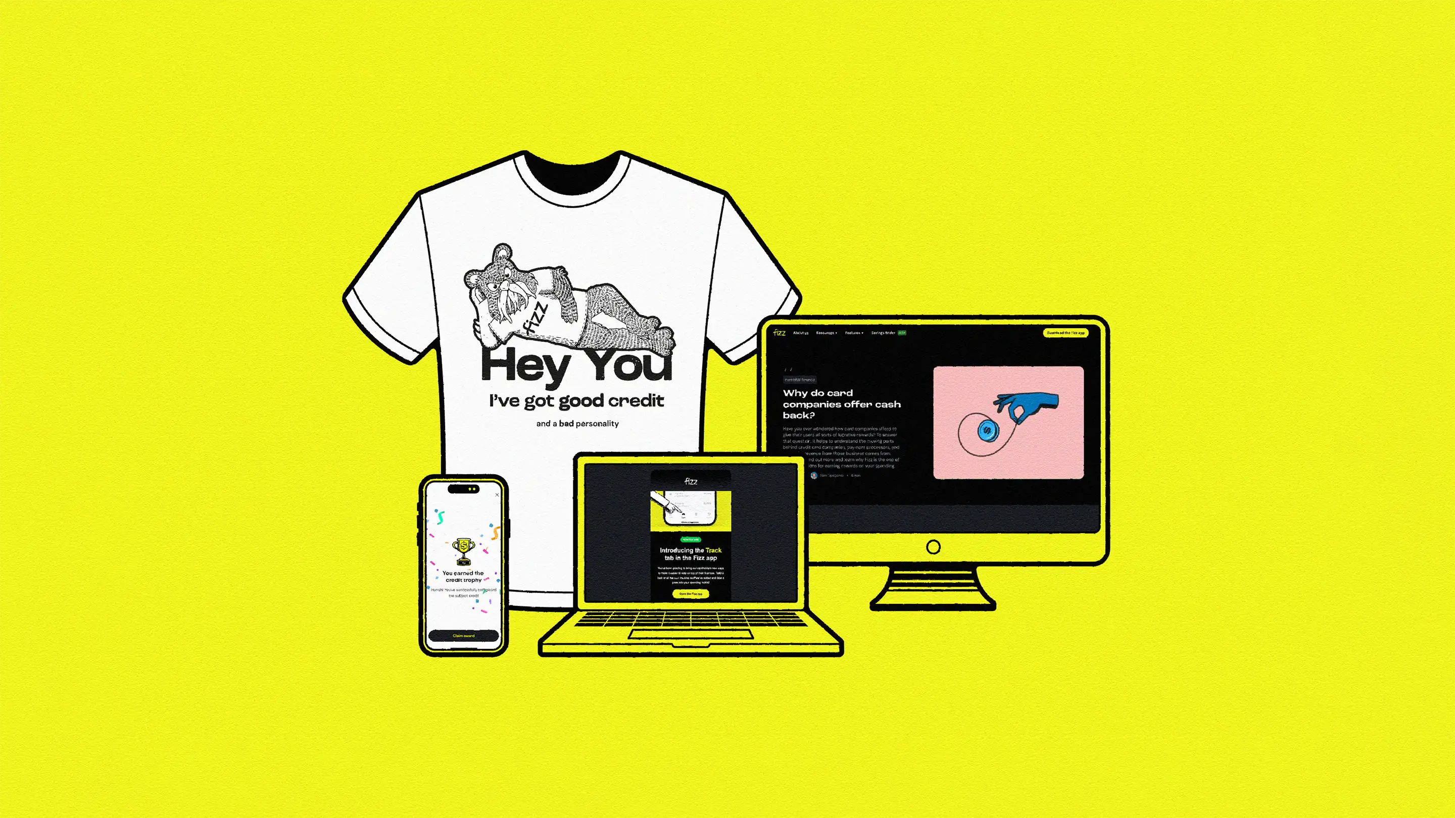
A significant portion of my output was illustration — for the app, email marketing, social media, merchandise, and blog content. Rather than depicting financial concepts literally, I developed a visual language that references money and credit obliquely: through metaphor, suggestion, and the occasional visual joke. The goal was to avoid the monotony of piggy banks and credit cards while keeping the subject matter legible. We accumulated a substantial asset library over the two years — versatile enough to be used across channels with minimal adaptation.
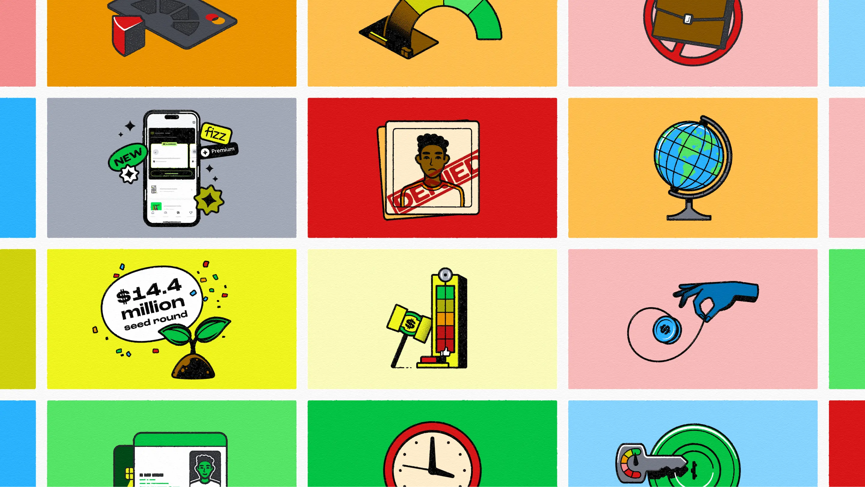
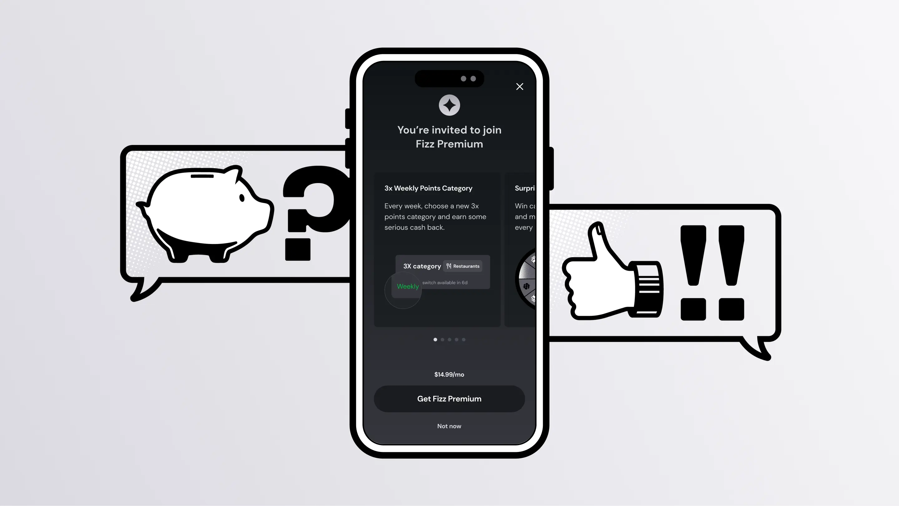
Fizz Premium
Fizz Premium was a new subscription tier offering enhanced insights, savings, and cashback. It needed its own visual identity — distinct enough to signal added value, familiar enough to feel like the same family. Conceptualization was collaborative, but the head of design deferred to me on visual and brand direction for the Premium branch. The solution was a platinum colorway over the base brand's yellow, and a modified logo where the dot of the lowercase “i” was inverted into a sparkle — the Premium Sparkle became the primary signifier across all customer-facing Premium communication.
Email and social
I designed and built email marketing campaigns throughout the engagement. Email is deceptively complex — most marketing emails are built on HTML tables, and the variability in how different clients render them means edge cases and failsafes matter as much as the design itself. For social, the priority was standing out in a feed dominated by content competing for the same attention.
The result
Fizz Premium launched to positive reception — conversion rates were strong and stakeholder feedback was good. The illustration library grew into a substantial asset base used consistently across channels for the duration of the brand's life. Shortly after the engagement ended, Fizz rebranded and pivoted to a new direction entirely — which puts a clean full stop on what the collaboration was: two years of building something that worked for where the company was at the time.
Looking back
Remote collaboration kept the relationship professional rather than close, but it was a genuinely good working dynamic. What I valued most was the creative latitude — a startup brand aimed at a younger demographic is one of the few contexts where interesting visual work is actively encouraged rather than tolerated. The variety kept it sharp. I'm proud of how the brand evolved during the time I was part of it.
Want to see the full process?
Research findings, wireframes, user testing results, and complete design iterations are available to hiring managers and design leads.
If you liked this case study, you might also like
Sage
.