Matchbox
A concept gifting app designed from scratch to show what a complete product design process looks like in practice.
The project
Most of my client work lives under NDA. Matchbox exists because showing process matters as much as showing output — and a concept project gives me the freedom to document every decision without compromising a client's privacy. The concept: a machine-learning app that helps you find better gifts by building a profile of the person you're shopping for.
My role
Solo, end-to-end. I ran the research, defined the product, designed the brand, built the information architecture, wireframed, designed high-fidelity screens, and ran user testing. No stakeholders, no handoff — which also meant no safety net.
The challenge
Three things made this interesting: designing for a wide demographic without defaulting to the lowest common denominator; making AI-driven functionality feel trustworthy to an audience increasingly wary of it; and building enough research rigour into a solo project to make the findings credible.
What I did
Research with intent
I surveyed and interviewed a pool of 10 people, deliberately sourced through second-degree connections rather than friends or acquaintances to eliminate social bias. Participants were selected based on personas developed through independent desk research — so the research was testing assumptions, not just confirming them.
One finding shaped the brand more than the product: romantic partners, not children, are the most common gift recipients. That meant the app needed to feel approachable without feeling like it was made for children — a distinction that fed directly into color, typography, and tone of voice.
Designing around distrust
The original concept leaned into AI as a selling point. Research pushed back — skepticism toward AI was a consistent theme across age groups. The solution was to keep the algorithmic functionality entirely in the background and let the interaction feel organic. The app learns from you; it just doesn't make a show of it.
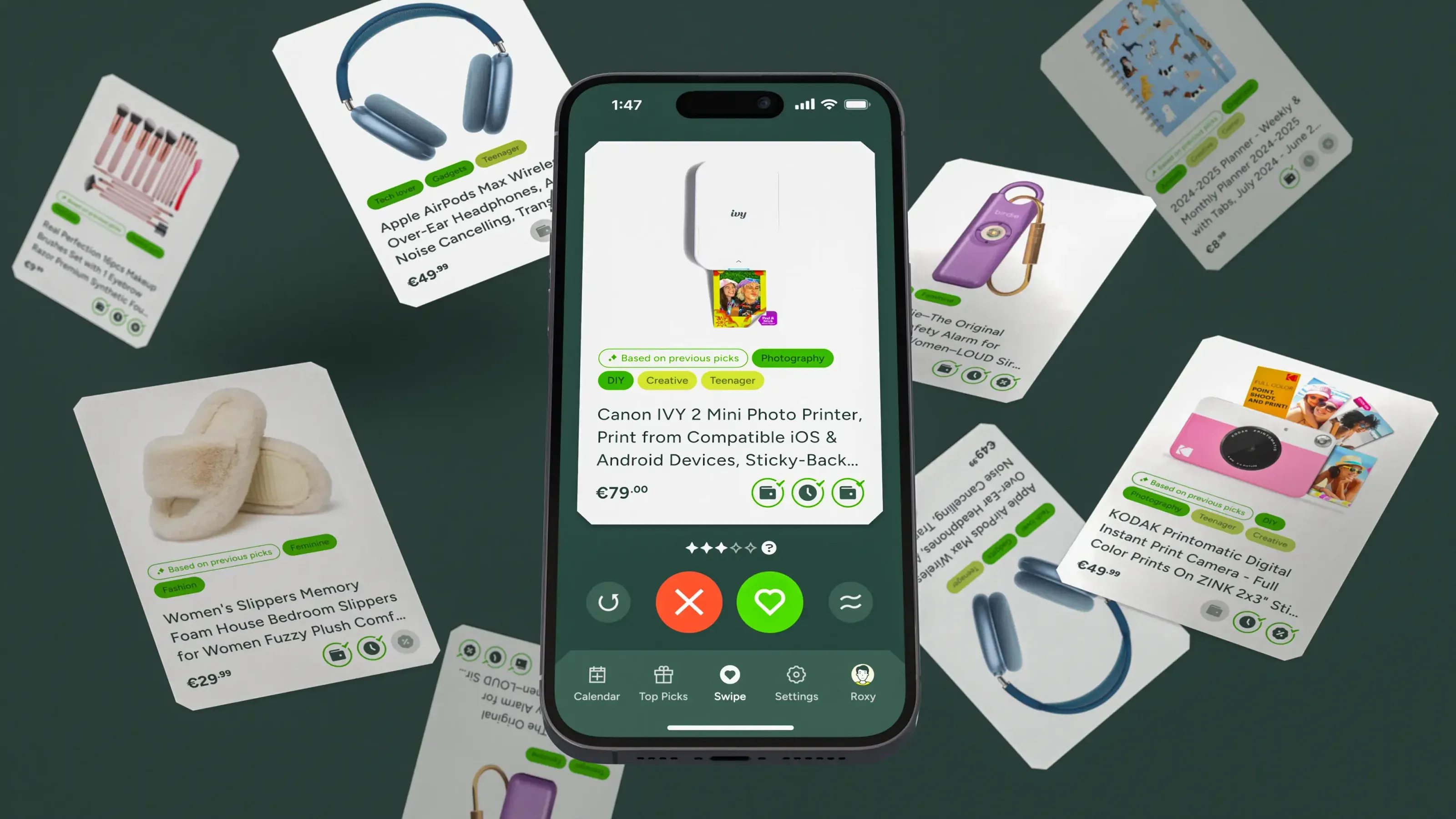
The swiping mechanic
The core interaction — swiping to rate potential gifts — was a deliberate choice. A haptic, physical interaction with natural motion creates enough intentional friction to minimize erroneous inputs, while staying intuitive for anyone familiar with a dating app. Built today, I'd likely explore a conversational UI instead. In 2024, this was the right call.
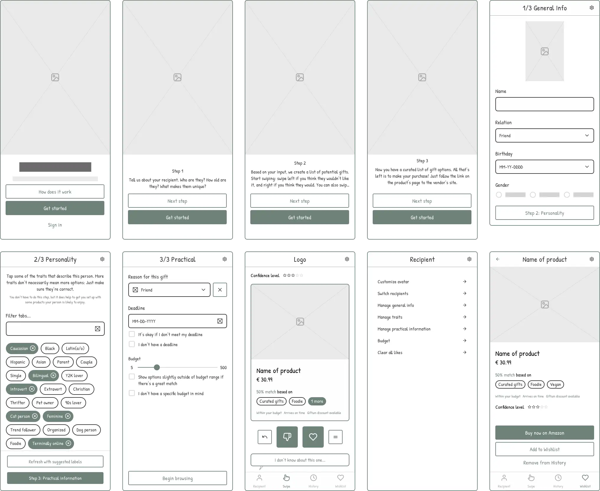
Onboarding without friction
The biggest drop-off risk for any consumer app is the signup flow. Matchbox's answer: no signup at all, initially. Users get a locally stored account on first launch and can formalize it later if they want to. All it takes to get started is adding a recipient.
The result
Matchbox is a concept, so there are no business metrics. What it demonstrates is a complete, research-backed design process from brief to tested prototype — including the decisions I'd make differently today, which is itself part of the point.
Looking back
A real client engagement would look meaningfully different. Stakeholder management, business constraints, and competing priorities all shape product decisions in ways a solo project can't replicate. Matchbox wasn't meant to simulate that — it was meant to show how I think when the only brief is to do good work.
Want to see the full process?
Research findings, wireframes, user testing results, and complete design iterations are available to hiring managers and design leads.
If you liked this case study, you might also like
Sage
.